88年の歴史を持つモロゾフ旗艦店のショップデザインを手掛けるにあたって、二つのテーマを掲げた。一つは今までの利用客にも愛されるショップであること、もう一つはモロゾフの未来に、より期待感を抱かせるようなデザインである。
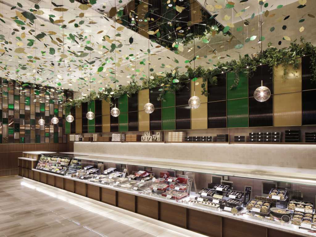
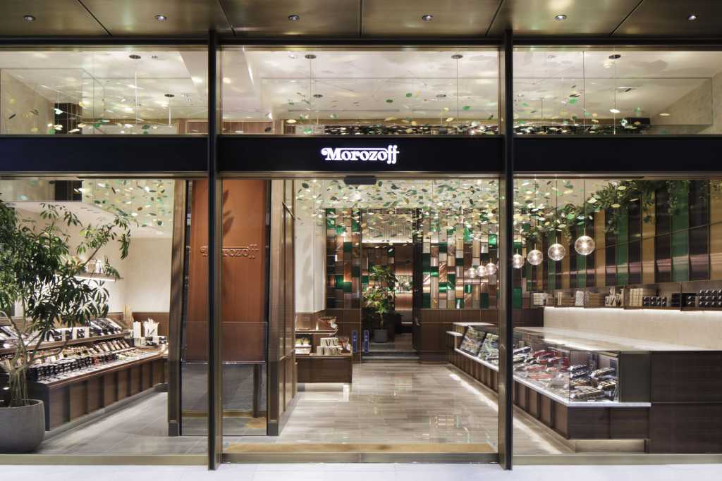
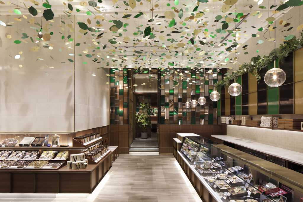
モロゾフを代表する菓子「アルカディア」の缶は、世間でも認知されている馴染みあるグラフィックであり、「アルカディア」とは古代ギリシャの「理想郷」を意味している。このパッケージから受ける印象をファサードに取り入れた。ゴールドと黒のパターンは、真鍮と黒皮鉄で重厚感と同時に繊細な印象で現し、ペイズリー柄の有機的な曲線は、ガラス越しに見えてくる葉型のアートで表情を現している。葉型(リーフ)のオブジェは、モロゾフのアイコン的な菓子の「ファヤージュ」と同じ形状でレーザーカットされたアルミパネルである。コーポレートカラーのグリーンとゴールドカラーで仕上げたリーフはライティングによって煌びやかな光を反射させ、その姿は期待感や幻想的な印象を与えてくれている。
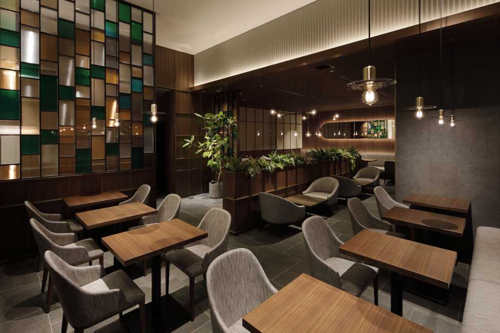
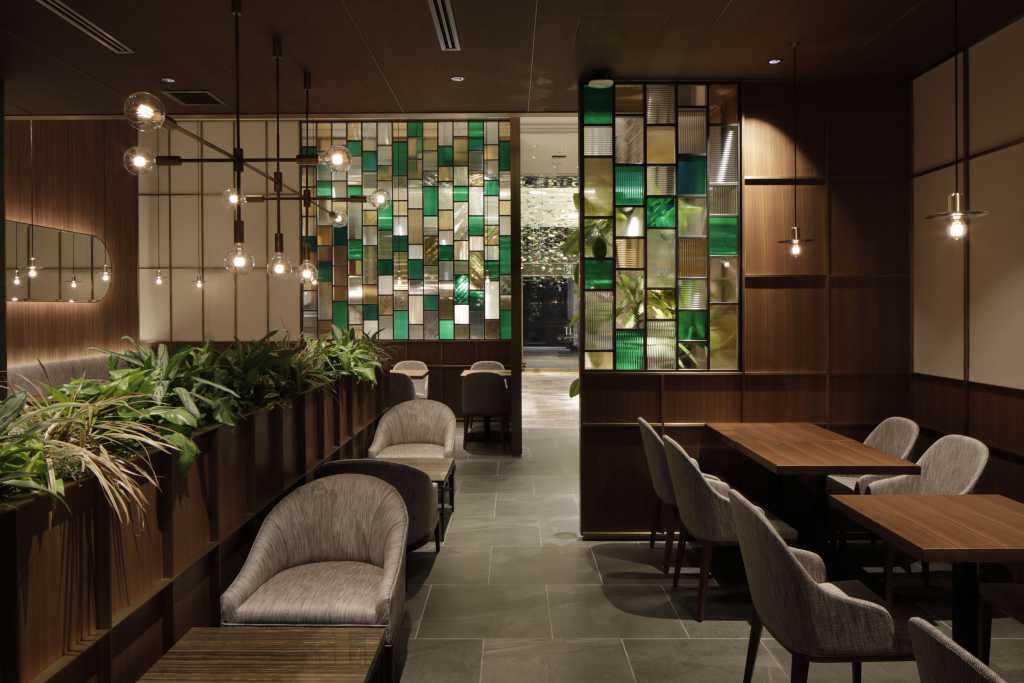
一方で、ショップの奥にあるカフェエリアは敢えてクラシックな意匠に仕上げた。より現代的な手前の販売エリアと、奥のカフェエリアを対照的に構成し、その間にガラスパーティションを施している。パーティションのガラスは、3色3種の異なるモールガラスで構成されており、それぞれのエリアに吊られたペンダントライトや、光で反射するリーフがガラスへ不規則に屈折し映り込み、大きなシャンデリアのように光を反射する。ガラスパーティションを通して先にあるエリアを見ると、それは過去からの歩みと、これからの未来を予感させるような関係性を作れるのではないかと考えた。この店舗では、モロゾフの歴史と未来を繋ぐようなデザインを目指した。(神田亮平/Roito)
「モロゾフ神戸本店」
オープン:2019年11月1日
所在地:兵庫県神戸市中央区三宮町1-8-1
設計者:Roito 神田亮平
床面積:201.4㎡
撮影:adhoc 志摩大輔
When approaching designing the Morozoff Flagship Store, which has a history of over 88 years, we set two themes. First, that it is a store that customers have loved since establishment, and secondly, that the design of new store would excite customers about Morozoff’s future even further. The can housing Morozoff’s most well-known sweet, “Arcadia,” is decorated with a graphic known around the world and its name originates in the ancient Greek concept of utopia. We incorporated the impression this packaging leaves on the viewer into the façade of the store. Using brass and cast iron to represent the gold and black pattern, we also achieved a solidness to the design while also imitating the organic paisley pattern with leaf-shaped art visible through the glass façade. The leaf-shaped object is an aluminum panel laser-cut into the same shape as the iconic Morozoff cookie, “Feuillage.” Finished in green and gold, corporate colors of Morozoff, the leaf sparkles in different ways depending on the light, lending a sense of excitement and fantasy.
On the other hand, in café located in the rear of the shop, finishing touches were made in an intentionally classic style. We contrasted the modern sales area in the front with the café area in the back, separated only by a glass panel. The glass partition is composed of three types of differently colored glass and a pendant lights hanging in each area, reflecting the light randomly from the leaf to resemble something like a large chandelier. Looking around the area past the glass partition, we had the idea that we could create a relationship between Morozoff’s path up to now and its future. Our aim for this store was to create a design connecting Morozoff’s past and future. (Ryohei Kanda / Roito)
【MOROZOFF FLAGSHIP STORE】
Address:1-8-1, Sannomiya-cho, Chuo-ku, Kobe-shi, Hyogo
Open:Nov. 1st,2019
Design:Roito Ryohei Kanda
Floor area:201.42㎡
Photo:adhoc Daisuke Shima
在着手设计拥有88年历史的Morozoff摩洛索夫旗舰店的店面时,提出了两个主题。一是迄今惠顾的客人们也会喜爱的店铺,另一个是让Morozoff的未来,更加抱有期待感的设计。
Morozoff的主打畅销点心“ARCADIA欧琍嘉黛”的盒子,印着被世人众所周知的图案,“ARCADIA”是享誉着古代希腊的“理想乡”之意。将从这个包装图案中感受到的印象,加入到设计的主体中。金色与黑色的样式,是用黄铜和黑皮铁来展现厚重感的同时又具有细腻的印象。佩斯利图案的有机性曲线,是透过玻璃觑见叶型的艺术饰品将表情展现出来。叶型(叶子)的题材,是和Morozoff代表性的点心“FEUILLAGE芙蘿嘉“相同的形状,用激光剪切而成的铝片。将企业的主题代表色的绿色和金色制成的叶子,通过不同的采光而反射出灿烂夺目的光,那种姿态迸发出期待感以及幻想性的印象。
另一方面,店铺里侧的咖啡厅区域,大胆地运用了古典的意匠。将更加现代化的的前侧贩卖区域,与里侧的咖啡厅区域构成对比,中间加设玻璃区间隔断。隔断玻璃是以3种颜色,3种不同的雾面玻璃构成,各个区域悬挂的吊灯,还有利用光照反射的叶子,不规则地折射到玻璃上,犹如巨大的水晶吊灯一样反射着光线。透过玻璃隔断望见前方的区域,我考虑到是否可以以此创造出,使之预感到从过去而来的脚步,迈向未来前路的关系性。这家店铺的目标是衔接Morozoff的历史与未来的设计。(神田亮平/Roito)
【MOROZOFF FLAGSHIP STORE 摩洛索夫神户旗舰店】
开业:2019年11月1日
地址:兵库县神户市中央区三宫町1-8-1
设计:Roito 神田亮平
实用面积:201.42㎡
摄影:adhoc 志摩大辅